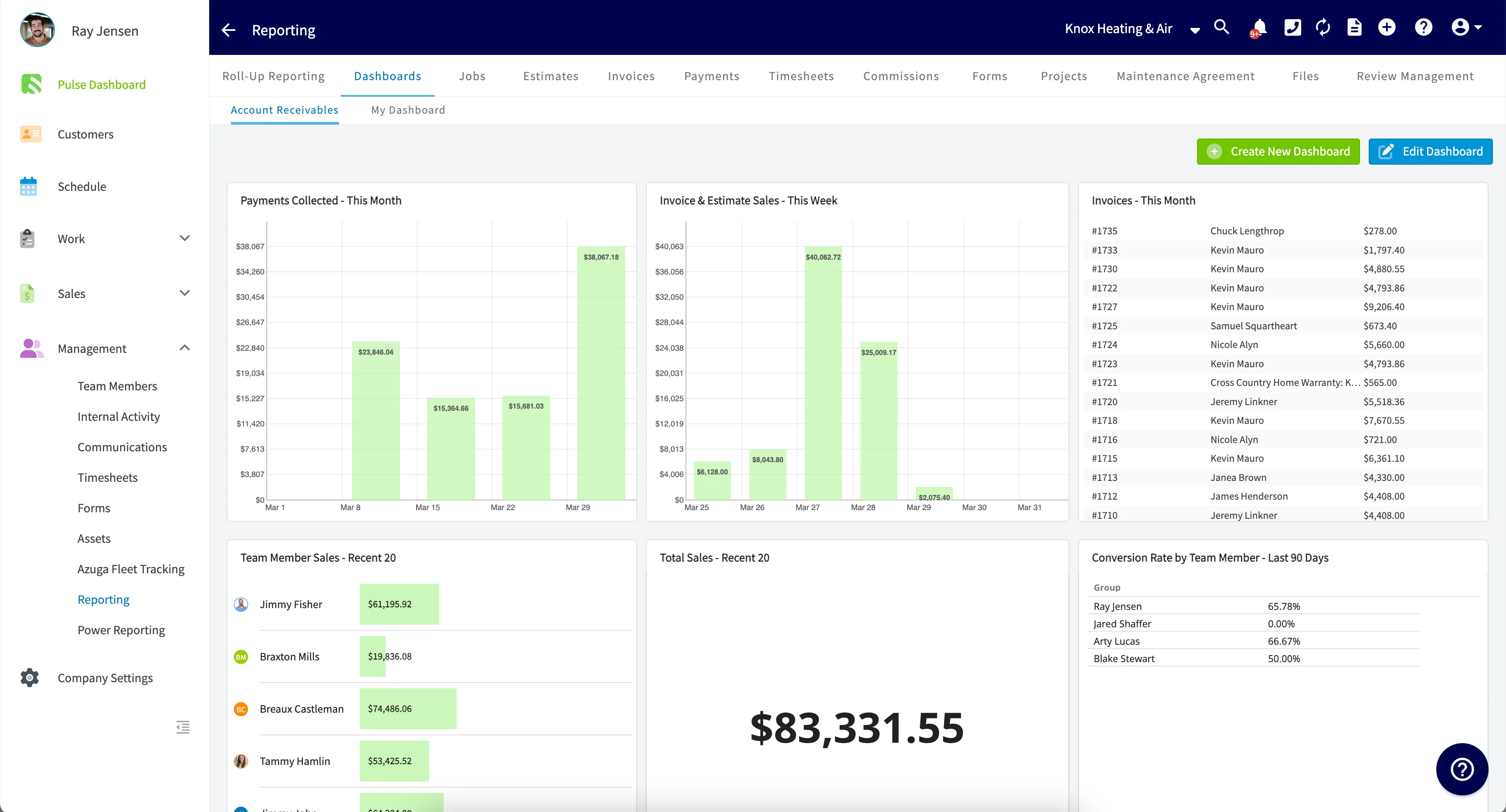
Who uses this: Admin users and Team Managers with reporting permissions — the dashboards you create under the Reporting tab are available to those roles. Availability: All regions · FieldPulse web app.A custom reporting dashboard is your Pulse Dashboard showing the reports you built yourself. You save a raw data report as a widget, add that widget to the dashboard, and set the date range and size it displays at, so the numbers you check most sit in one view and update automatically instead of being rebuilt every time. The custom reporting dashboard is part of FieldPulse’s dashboards and reporting.
Overview
Building a custom reporting dashboard takes two stages. First you save the reports you want as widgets, then you configure the dashboard to display them.- Save the reports you want as widgets. Any raw data report can become a widget, and both traditional reports and visual reports can go on a custom reporting dashboard.
- Configure the dashboard. From your Pulse Dashboard, pick which widgets appear, set each widget’s date range, and size the rows and widgets.
Video walkthrough
Video walkthrough: building and configuring the custom reporting dashboard
Before you begin
- Decide which numbers you want on the dashboard. Every custom widget comes from a raw data report you saved, so the reports come first and the dashboard second.
- If you have not built a raw data report before, start with How to Use Raw Data Reporting.
On web
Save reports as widgets
-
In the left-side menu, under Management, select Reporting.
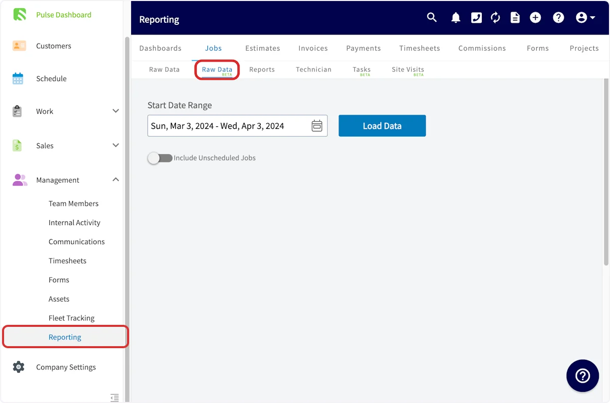
- Build the report you want on the dashboard. Both traditional reports and visual reports can be used.
-
Select Save as Report, then select Save Report as Widget.
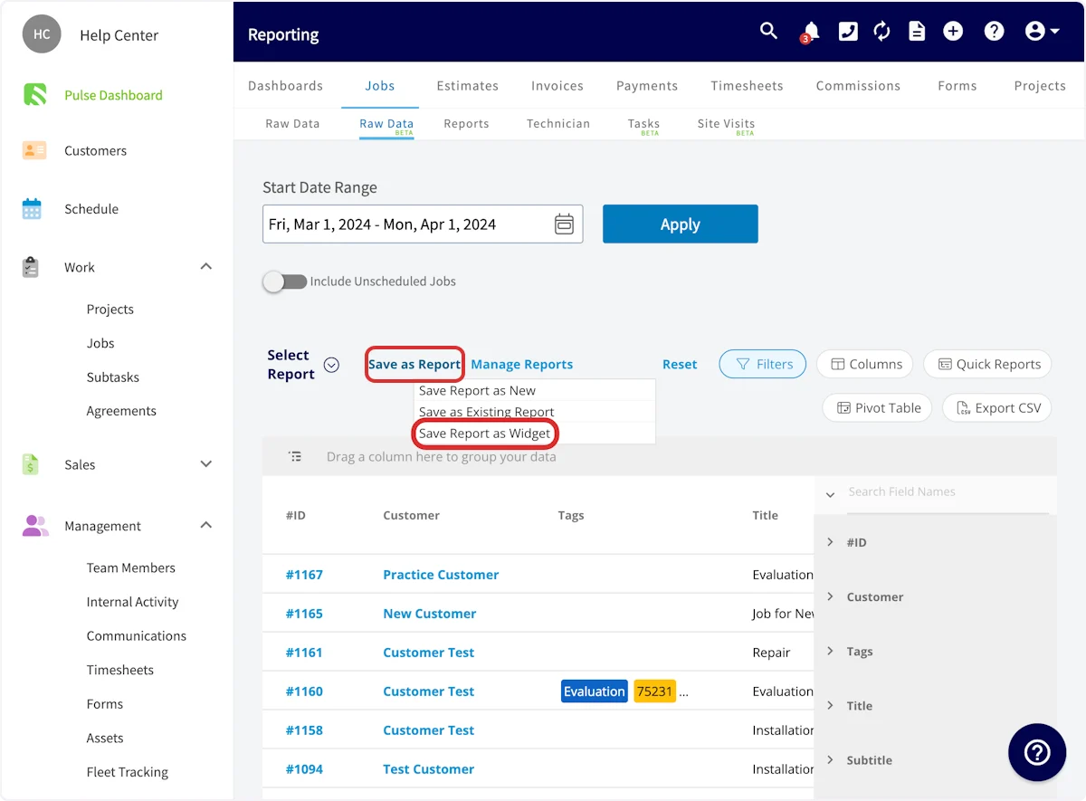
-
Enter a title for the widget and select Save Widget.
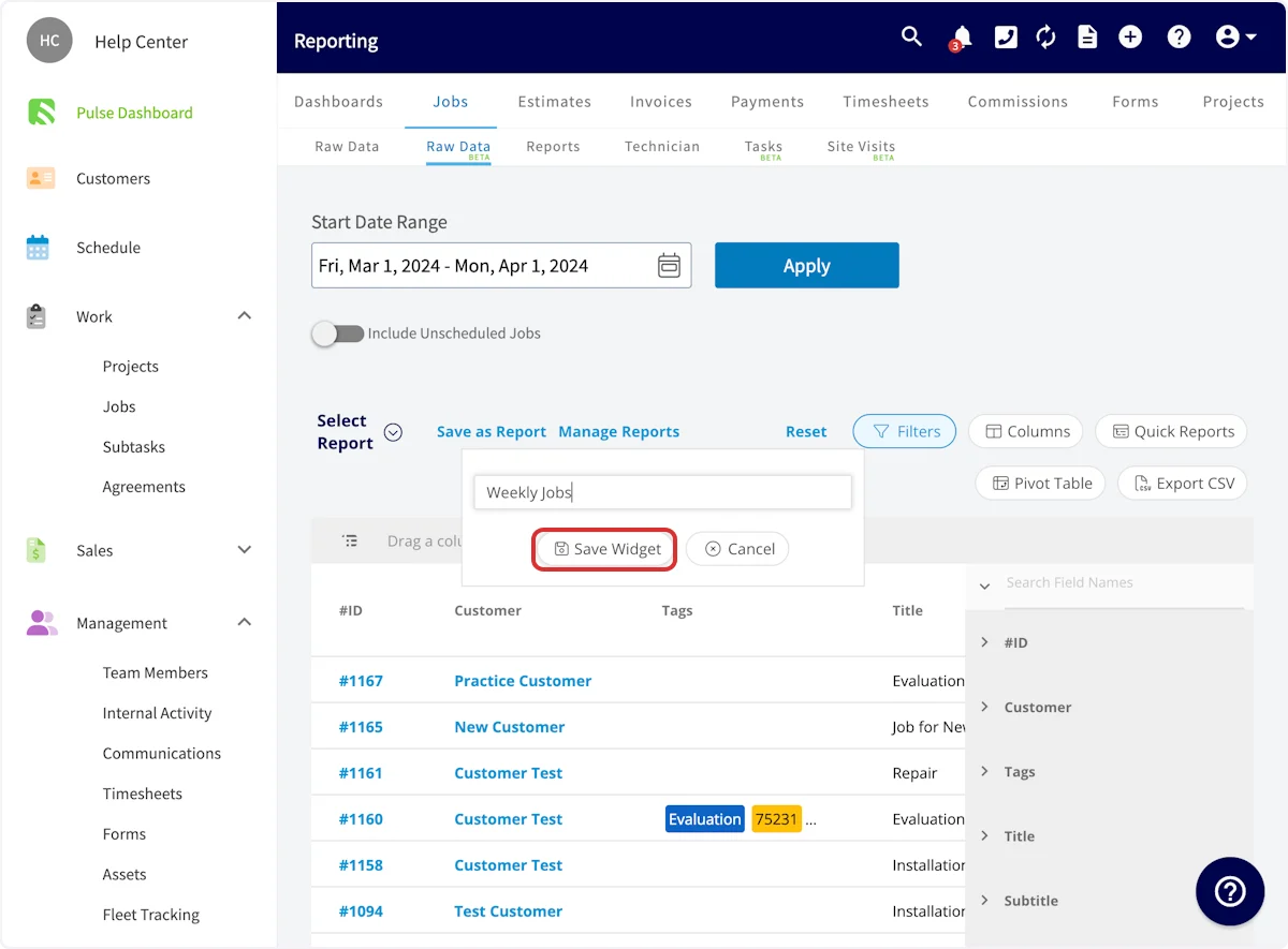
- Repeat for every report you want on the dashboard.
Configure the dashboard
-
Go to your Pulse Dashboard and select Configure Dashboard.

-
Select a report. For each widget, set Widget Type to Preset or Custom. To use a report you saved, select Custom, then choose the report by name from the Widget list.
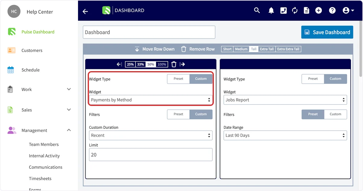
-
Apply filters. Filters set the date range of data the widget shows. Select Preset and pick a Date Range such as This Month, Today, or Last 90 Days, or select Custom and set a Custom Duration with a Limit for the maximum number of recent data points to include.
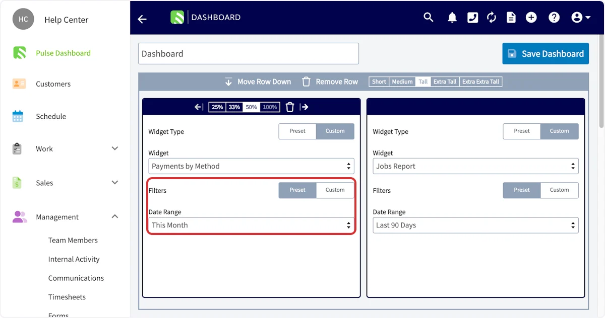
- Save the dashboard. When the dashboard looks right, select Save Dashboard.
Adjust the display
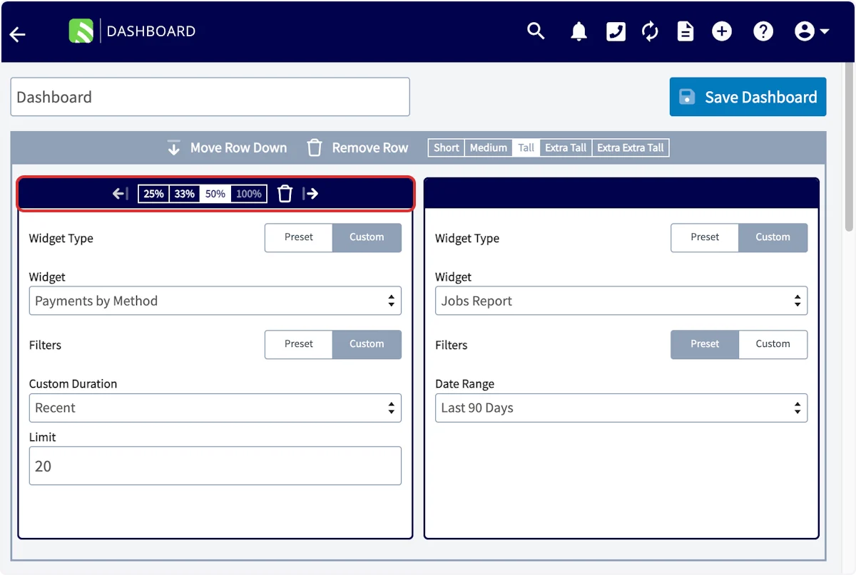
Fine-tune the layout from the same configuration view:- Rows — use the gray bar above each row to move the row up or down, remove the row entirely, or set its height to Short, Medium, Tall, Extra Tall, or Extra Extra Tall.
- Widget width — set each widget to occupy 25%, 33%, 50%, or 100% of its row.
- Widget order — use the left and right arrows at the top of a widget to rearrange it within the row.
- Remove a widget — select the trash can icon on the widget.
- Add more — select Add Row or Add Widget.
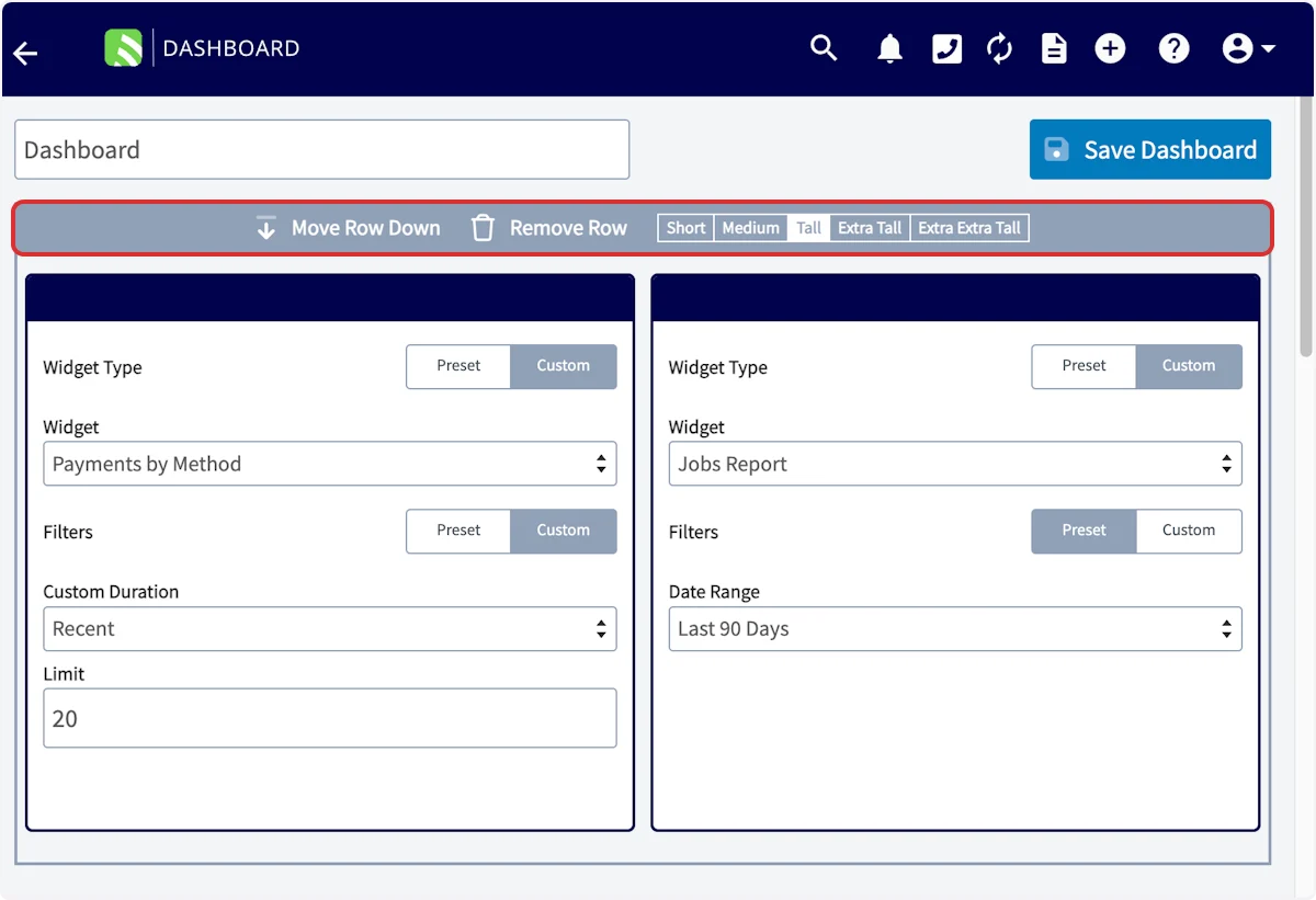
Create additional dashboards
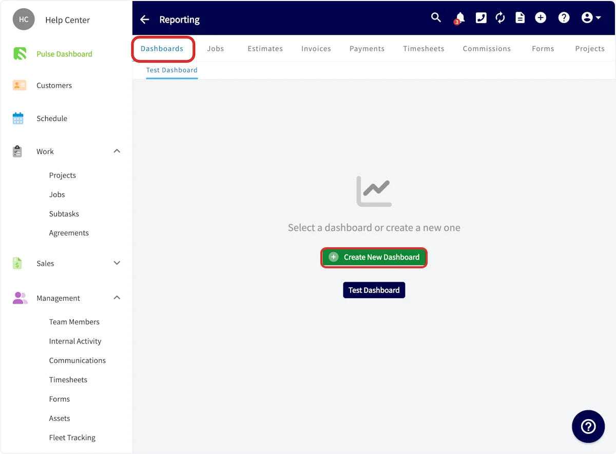
To group reports outside the Pulse Dashboard, select the Reporting tab, choose Dashboards, then select Create New Dashboard. These extra dashboards do not display on your Pulse Dashboard, and they give you a convenient way to view a set of reports together.