
Who uses this: Admins have Full Reporting access, and Team Managers can be given it. Service Agents and Limited Agents do not have Full Reporting access. Availability: All regions.Raw data reporting is where you build a report on the records you already keep in FieldPulse — jobs, estimates, invoices, payments, timesheets, and more — by setting a date range, picking the columns you want, and grouping the results. Each record type has its own tab, and every tab is built the same way, so the workflow on this page is the one you use for all of them. Raw data reporting is part of FieldPulse’s dashboards and reporting.
Overview
A raw data report is a table of one record type, shaped by the date range, columns, filters, and grouping you choose. You open it from Reporting under Management in the left-side menu, then select the tab for the record type you want to report on. Every report follows the same six steps:- Open raw data reporting and select the record type’s tab.
- Choose the date type the report runs on, where the tab offers one.
- Set the date range and load the data.
- Choose which columns to show.
- Filter and group the results.
- Save the report, export it, or turn it into a dashboard widget.
Video walkthrough
Video walkthrough: Raw Data Reporting Basics
Video walkthrough: Raw Data Reporting
Before you begin
- Check that your role has reporting access. An Admin has Full Reporting access, and a Team Manager can be given it. See User Roles and Permissions Details.
- Decide which record type you want to report on. Each record type keeps its own default columns and its own filter fields, listed on that record type’s page under Report types.
Open raw data reporting
- In the left-side menu, under Management, select Reporting.
- Select the tab for the record type you want to report on — for example, Jobs or Payments.
- Select Raw Data.
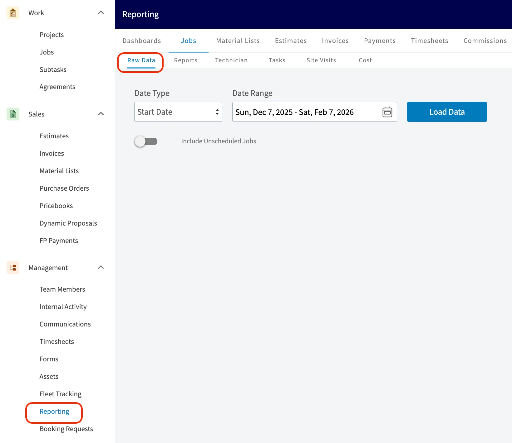
Set the date type and date range
The date type tells FieldPulse which date on the record the report matches your range against, and the date range sets the window the report pulls from.- Choose the Date Type, where the tab offers one. The Jobs tab reports on Start Date; the Commissions tab offers Related Record Created Date, Invoiced Date, First Payment Date, Fully Paid Date, Related Work Order Completed Date, and Estimate Accepted Date. Where a tab has no date type, start with the date range.
- Select the calendar icon and pick your start and end dates, or select one of the presets to the left of the calendars.
- Select Load Data.
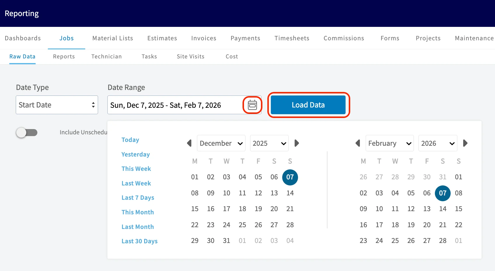
Customize the report
Once the data loads, four controls shape what the report shows — Columns, Filters, groupings, and Quick Reports — and the Pivot Table rearranges the loaded data for deeper analysis.Columns
Select Columns to choose which fields appear in the report table and the order they appear in. Check the fields you want to include and uncheck the ones you don’t.
Filters
Select Filters to narrow the report to the records you want. You can filter on any field on the record — for example, to see only invoices that have been invoiced but not yet paid.
Groupings
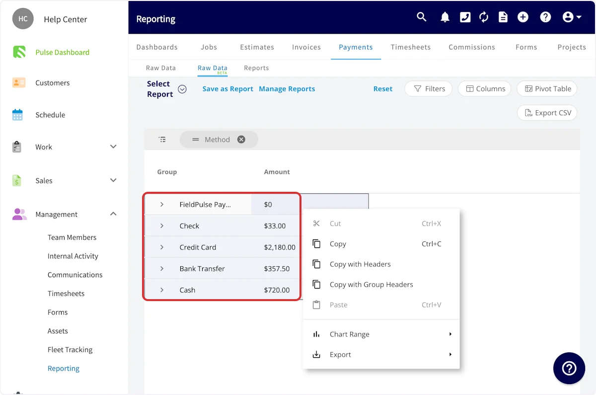
Drag a column into the grouping bar above the table to group the rows by the unique values in that column. Group a payments report by Method to see a total per payment method, or group a report by Customer to roll the rows up under each unique customer. You can drag in more than one column.
Quick Reports
Select Quick Reports to build a report in one step from a combination of standard data parameters that are commonly used to build reports — for example, the total commission received each week, grouped by the team member who received it.
Pivot Table
Select Pivot Table to summarize and rearrange a large data set so you can read it from a different angle instead of scrolling a long list of rows. Quick Reports is the fastest route to the common breakdowns; the pivot table is the option when you want to tailor the report further.
Save or export the report
Save as Report
Select Save as Report to keep the report instead of rebuilding it next time, then choose one of two options.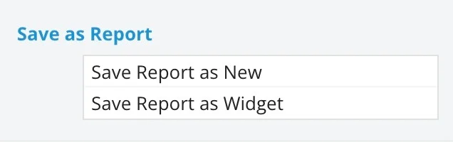
- Save Report as New — saves the report under Select Report so you can reopen it later. Title the report and save it.
- Save Report as Widget — saves the report as a widget you can add to your Pulse Dashboard. Title the widget and save it.
Export CSV
Select Export CSV to download the report currently displayed on your screen as a CSV file to your device.
Add the report to your Pulse Dashboard
Build the report the way you want it, save it with Save Report as Widget, then go to your Pulse Dashboard and select Configure Dashboard to place the widget, set the date range it displays, and size it. For the full dashboard build — selecting reports, applying filters, and arranging rows and widgets — see How to Build and Configure the Custom Reporting Dashboard.Build a visual report
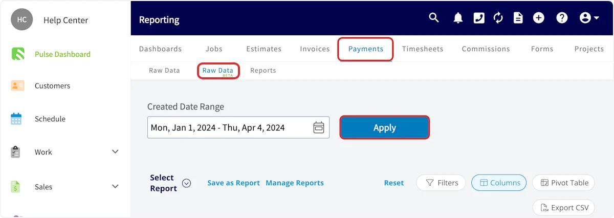
A visual report charts a loaded report instead of listing it as rows. Build one from the Raw Data BETA tab.- In the left-side menu, under Management, select Reporting, select the record type’s tab, then select Raw Data BETA.
-
Set the Created Date Range with the calendar icon, then select Apply.
-
Customize the report with filters, groupings, and columns, then highlight the fields you want included in the visual report.
-
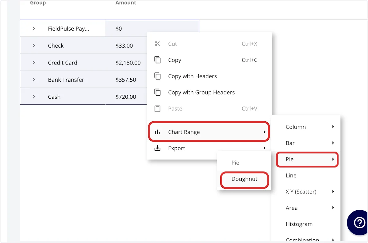
Right-click in the highlighted area, hover over Chart Range, and select the chart type you want. The menu offers Column, Bar, Pie, Line, X Y (Scatter), Area, Histogram, and Combination, and each one opens its own list of styles.
-
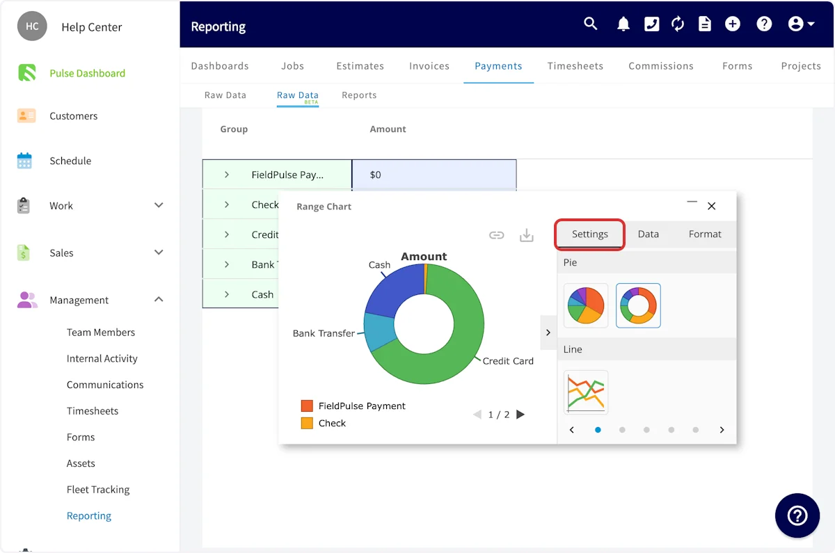
Use the Settings tab of the chart window to adjust the report type and color scheme.
-
Use the Data tab to adjust which categories the chart displays and which fields are excluded.
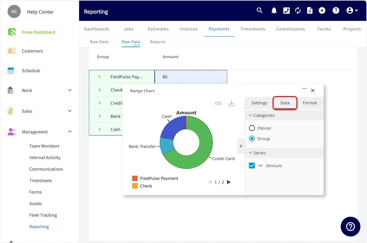
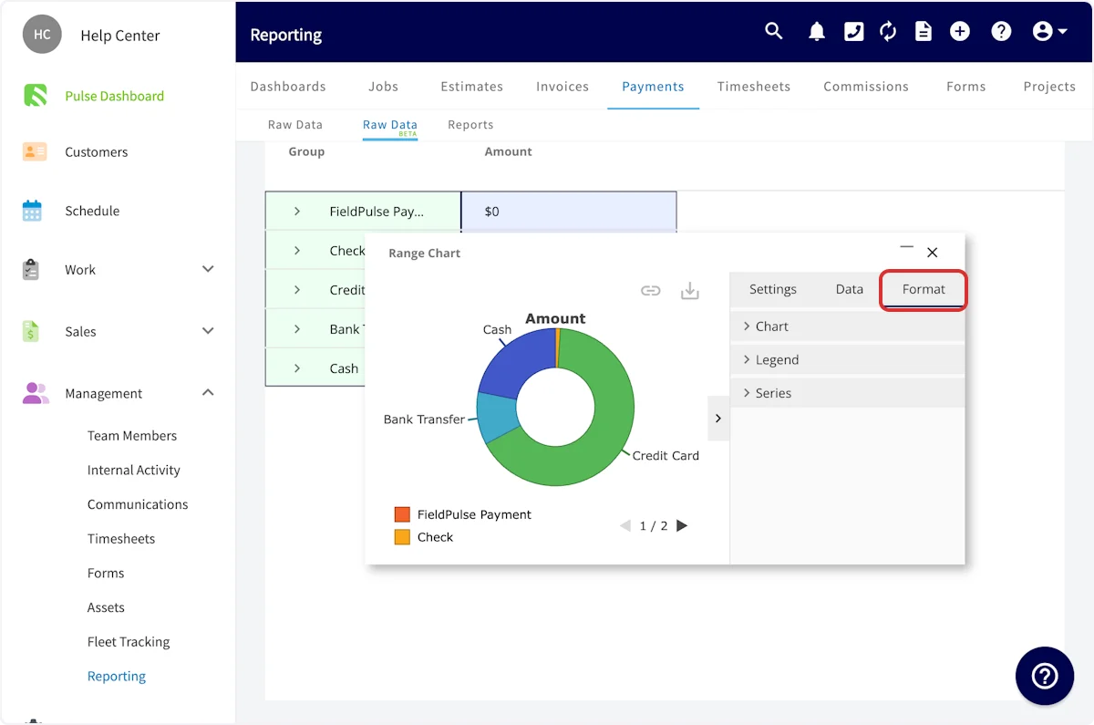
- Use the Format tab to adjust the report appearance — including font type, font size, and legend specifics — under its Chart, Legend, and Series sections.
Report types
Each record type below is its own report tab, with its own page covering that report’s default columns, filter fields, and common examples. The workflow above is the same on all of them.FAQs
Can I put a visual report on my Pulse Dashboard?
Yes. Both traditional reports and visual reports can be included on a custom reporting dashboard. See How to Build and Configure the Custom Reporting Dashboard.Can I copy report rows without exporting the whole report?
Yes. Right-click a highlighted selection on the Raw Data BETA tab and choose Copy, Copy with Headers, or Copy with Group Headers.Related articles
- How to Build and Configure the Custom Reporting Dashboard
- Pulse Dashboard Overview
- User Roles and Permissions Details